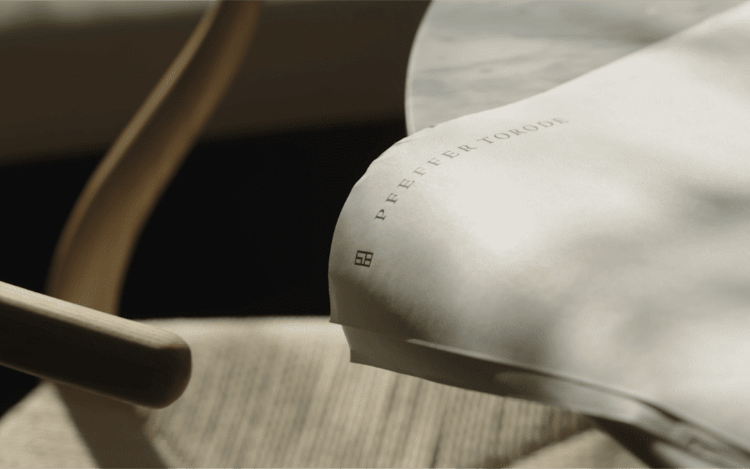
Pfeffer Torode
Collaborating With a Design-Focused Practice
When we first began work with Pfeffer Torode Architects, it became immediately clear that our job was to join a firm already undergoing a significant amount of change in the way they present themselves to the world. In the past, the firm had significant experience in commercial, hospitality, multi-family and residential real estate. Internally however, the practice was aligning to become much more focused on creating the premier high-end residential architecture firm in Nashville and beyond. Our job was to join that alignment and create a brand, language, and visual design system that their internal team could take, expand upon, and run with quickly.
After interviews with studio directors at each of their offices across the South, and with many architects that had worked at other firms, it became clear that what guided Pfeffer Torode went far beyond architectural style. It was a set of principles that drove this team to create places of life for their clients. This promise became the anchor around which the rest of the work orbited.

The inspiration for the brand mark for Pfeffer Torode was driven by the many styles of doors and windows in traditional and modern homes.


Office Signage & Window Vinyl

A modular print collateral collection that allows for robust and detailed presenations of home plans, materials, and client renderings.


A focused web portfolio experience that seeks to inspire both prospective clients and employees.