Salence
For the Uncharted Journey
Salence is a technical outwear brand that seeks to bring fashion and technical outwear performance together in a fashion-forward collection of outerwear. When we first engaged with Salence, we were inspired by their vision to create a line of technical outerwear that not only performed at the highest level but also looked stylish and modern.
Our goal was to create a brand that reflected Salence’s innovative approach to outerwear, combining advanced technical features with contemporary design. We worked closely with the Salence team to develop a brand identity that captured the essence of their vision and conveyed the unique value proposition of their products.
Logotype


Visual inspiration pulled from cartographic tools, maps, and a compass.

Symbol Design

Just like the Arwen, the five-fold symbol also represented a balance of the human nature. Many experts who have studied Celtic symbols and their meanings, claim that this symbol represents the five basic elements of the universe, namely fire, water, sun, earth, and air. However, some experts also believe that the middle fold is the universe, which is surrounded by fire, water, earth, and air.


Branded signage, exploration for future in store experiences.

With every expression of the brand we sought to bring together the two distinct worlds of technical performance and fashion

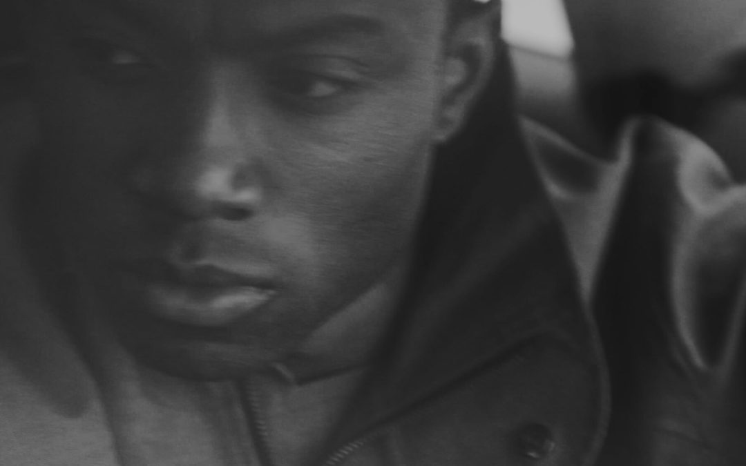
Photography & Videography by Bob Miller.


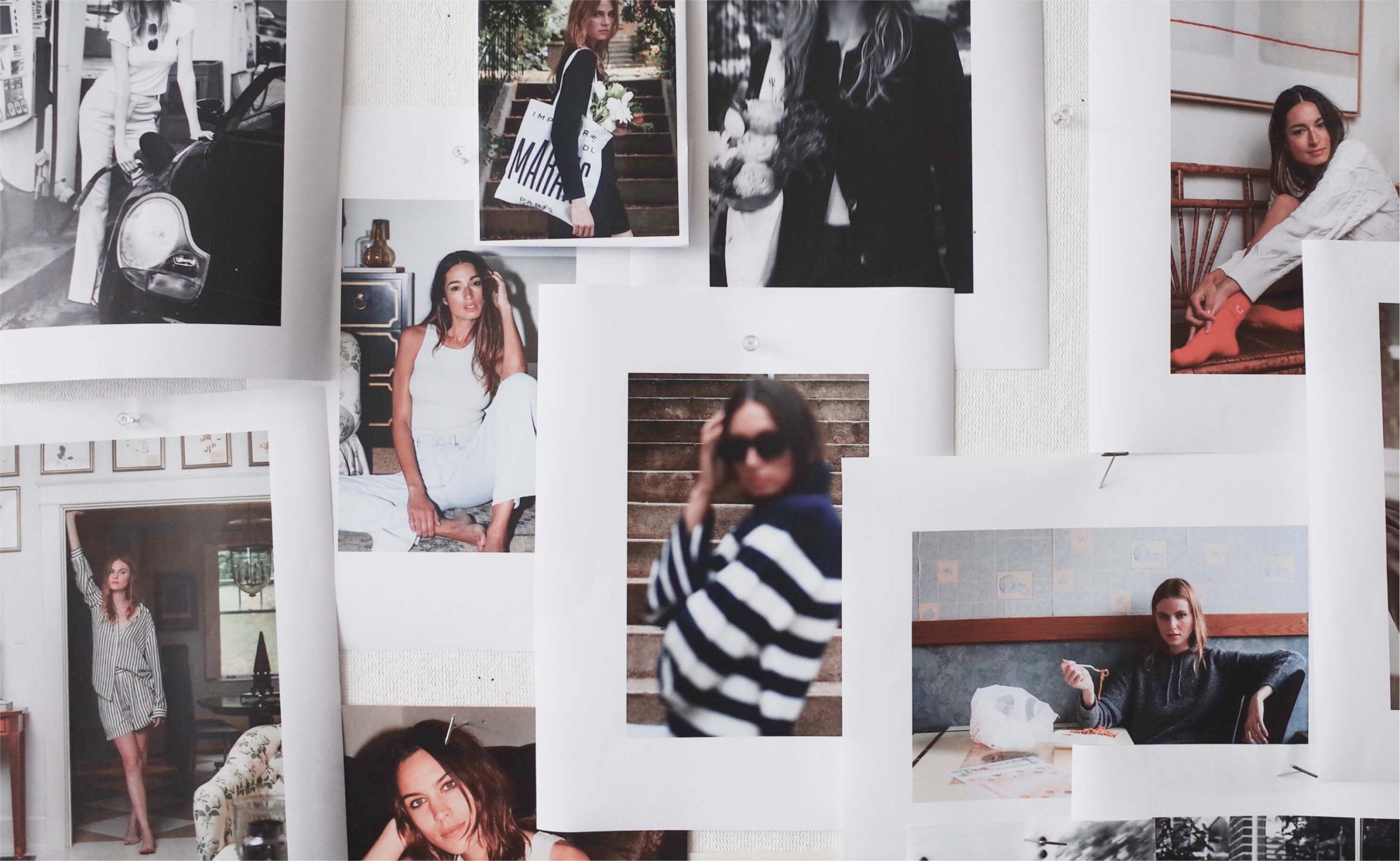
Lifestyle & Studio photography to launch the brand at NY Fashion Week.


Dreamcatcher offal readymade put a bird on it jianbing pork belly, shaman kitsch beard deep v kombucha vinyl stumptown. Pop-up fam edison bulb hot chicken.

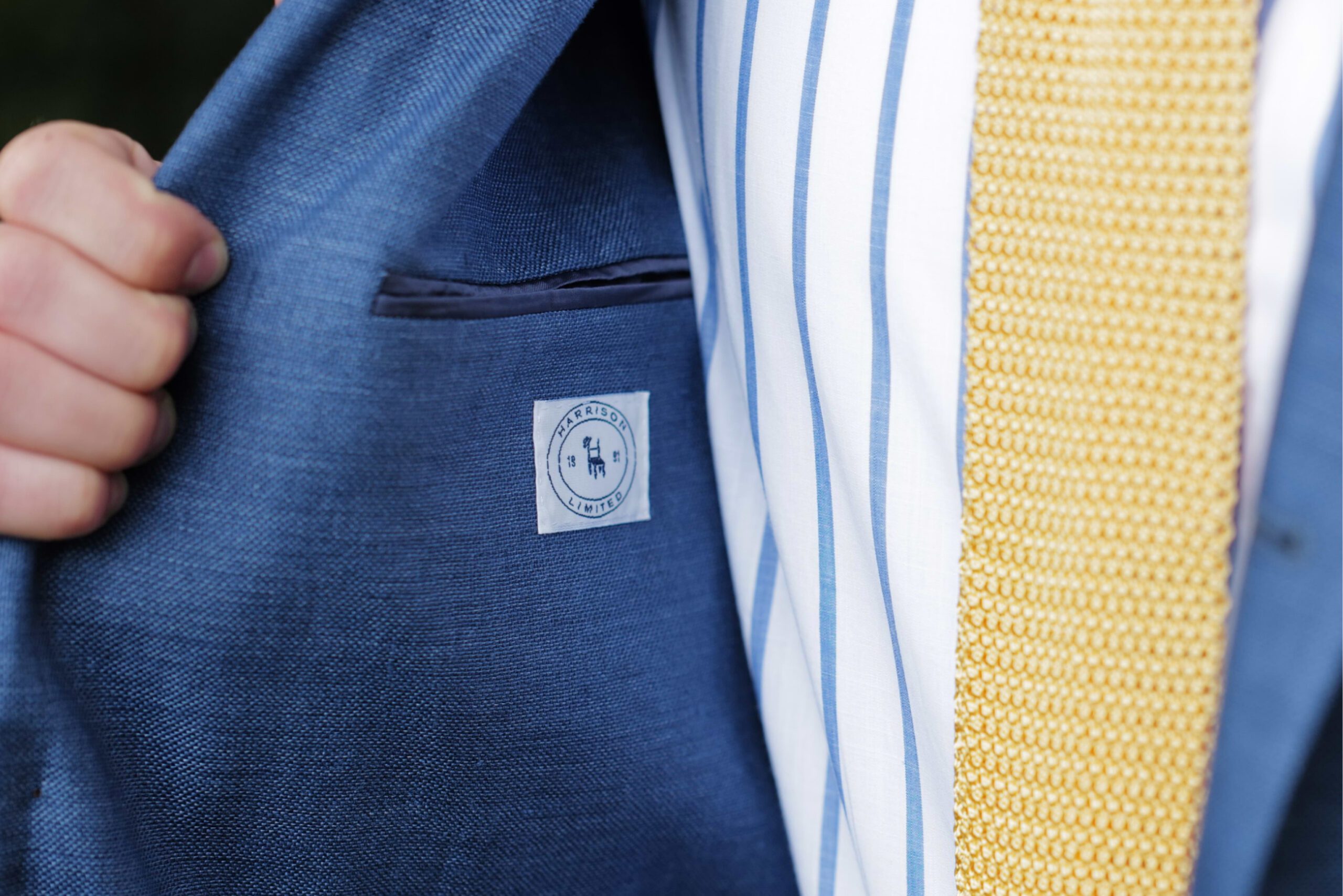
Branded print collateral designed for use in US tradeshows, and to keep the brand vision clear with overseas manufacturing partners.